Key Concepts
The Module Builder is where you design how your data is structured and how forms look when creating or editing records.
Layout
The arrangement of fields on a record form. Fields live inside sections, and you control the order by dragging.
Section
A named group of fields on the form. Use sections to organize related fields together (e.g., "Contact Info", "Address").
Field Type
The kind of data a field holds — text, number, date, dropdown, lookup, etc. You pick the type when creating a field.
Card View
The compact representation of a record shown in list views, related lists, and lookup hover cards. You choose which fields appear.
Form Rule
Conditional logic that changes the form dynamically — showing/hiding fields, making them required, or prefilling values based on other field values.
Block
A unit within a form rule. Each block has a condition (FOR) and one or more actions (DO). A rule can have multiple blocks.
Layout Tab
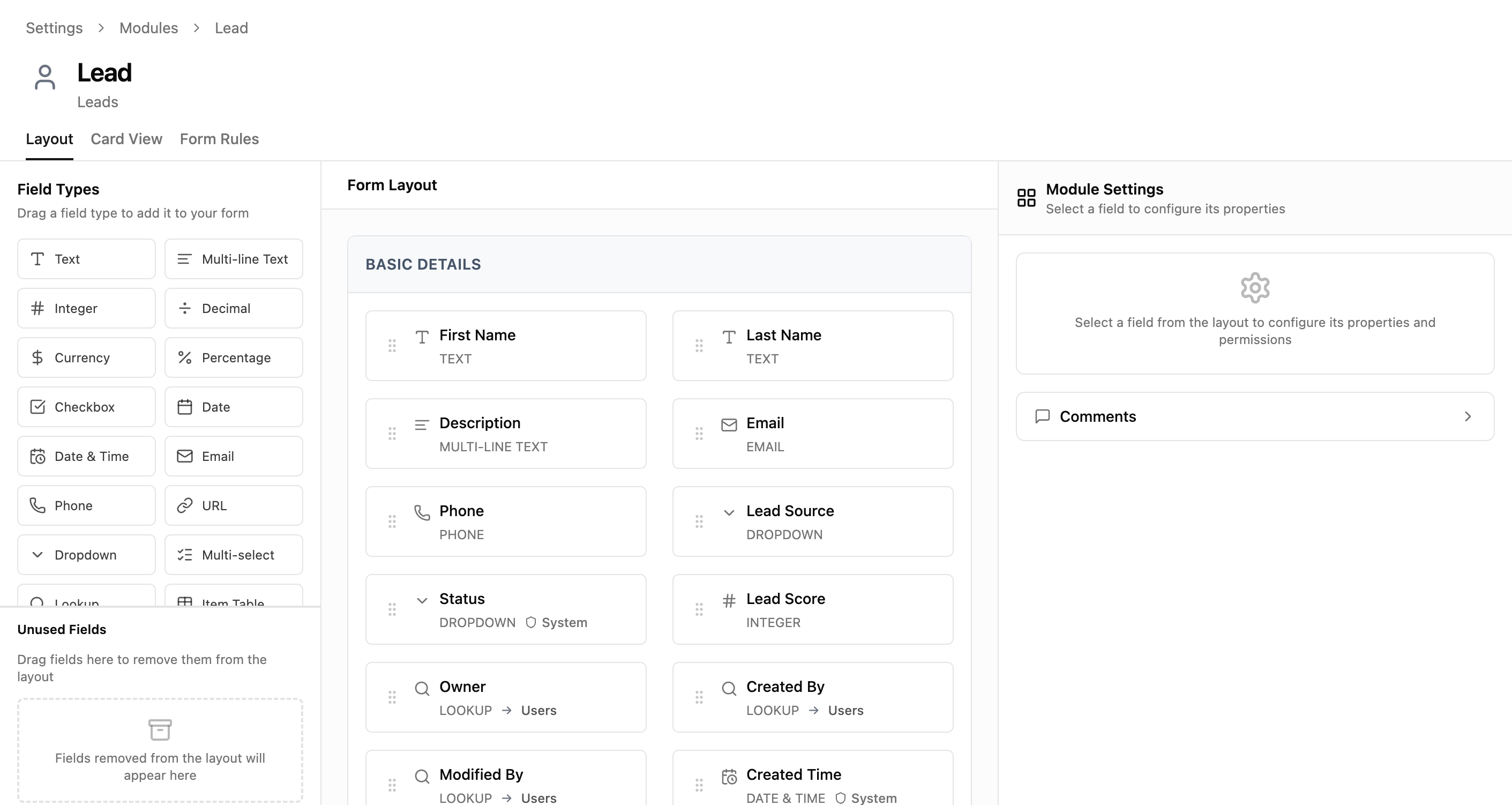
The Layout tab is a three-panel workspace where you build your record form by dragging field types into sections.
Panel Layout
| Panel | Location | What It Does |
|---|---|---|
| Field Types | Left | A palette of 20 draggable field types plus a Section divider. Also contains the Unused Fields bin. |
| Form Layout | Center | Your form's live structure. Fields are organized into named sections. Drag to reorder. |
| Module Settings | Right | Properties panel for the selected field. Appears when you click a field in the layout. |
Header Controls
| Element | What It Does |
|---|---|
| Change icon | Opens a picker to change the module's sidebar icon and color. |
| Module name button | Shows singular/plural names. Click to edit the module's display name. |
| Layout / Card View / Form Rules | Tab navigation between the three configuration modes. |
Adding Fields
To add a field to your form, drag a field type from the left panel and drop it into a section in the center panel.
Available Field Types
| Type | Stores |
|---|---|
| Text | Single-line text (up to 255 characters) |
| Multi-line Text | Longer text content with line breaks |
| Integer | Whole numbers (no decimals) |
| Decimal | Numbers with decimal places |
| Currency | Monetary values with currency formatting |
| Percentage | Percentage values (displayed with %) |
| Checkbox | True/false toggle |
| Date | Calendar date (no time component) |
| Date & Time | Full timestamp with date and time |
| Email address with format validation | |
| Phone | Phone number |
| URL | Web address with format validation |
| Dropdown | Single selection from a predefined list of options |
| Multi-select | Multiple selections from a predefined list |
| Lookup | A link to a record in another module |
| Item Table | An embedded table of line items (e.g., invoice lines) |
| Formula | A calculated value derived from other fields |
| Auto Number | Automatically generated sequential identifier |
| File | File attachment (any type) |
| Image | Image upload with preview |
Unused Fields
Drag a field from the layout into the "Unused Fields" bin (bottom of the left panel) to remove it from the form without deleting its data. Fields here can be dragged back into the layout at any time.
Configuring Field Properties
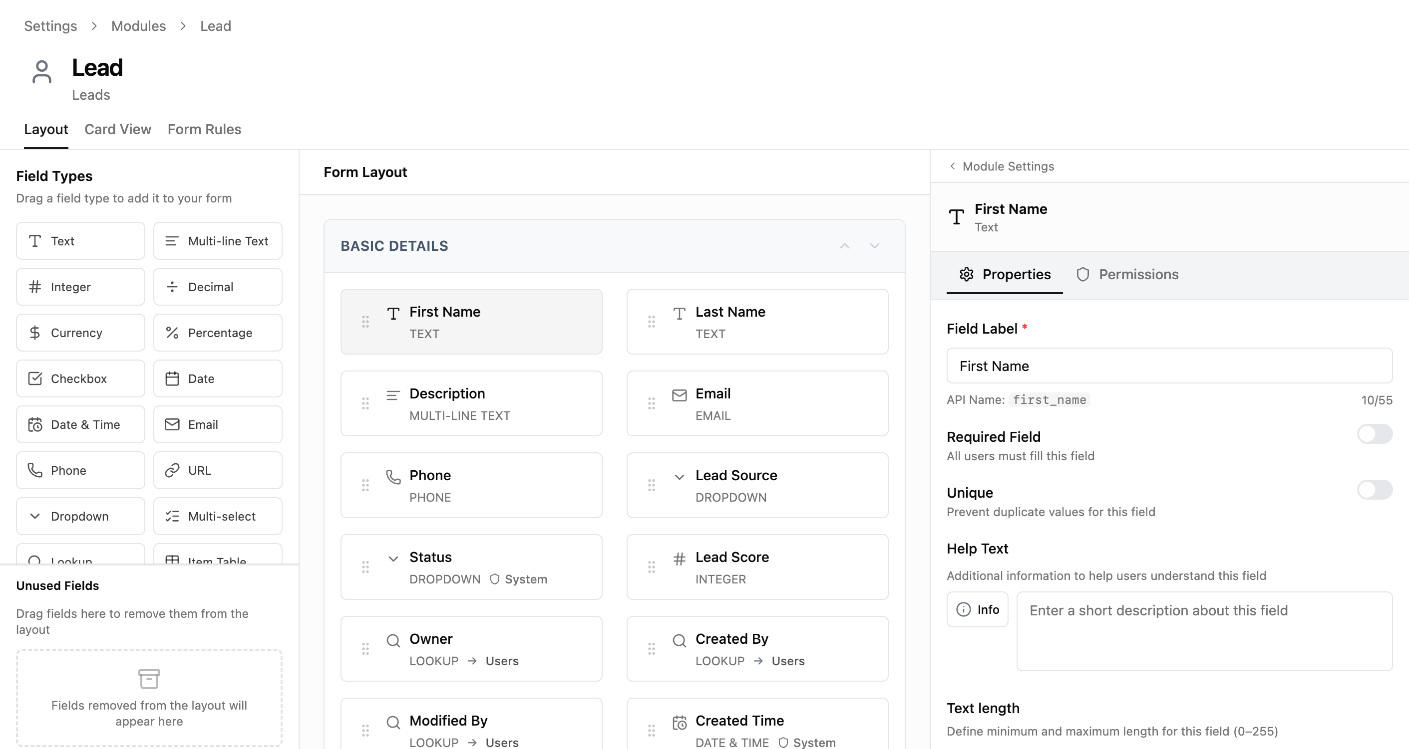
Click any field in the Form Layout to open its configuration in the right panel. The panel has two tabs: Properties and Permissions.
Properties Tab
| Property | Description |
|---|---|
| Field Label | The name displayed on the form. Required. Character count shown (e.g., 10/55). |
| API Name | System identifier used in integrations and formulas. Auto-generated, read-only after creation. |
| Required Field | Toggle on to make this field mandatory. Records cannot be saved without it. |
| Unique | Toggle on to prevent duplicate values across all records in this module. |
| Help Text | A description shown below the field to guide users on what to enter. |
| Text Length | Minimum and maximum character limits. Adjustable with +/- buttons or direct input. |
| Default Value | A pre-filled value for new records. Users can override it. |
Permissions Tab
Controls which roles can see or edit this specific field. This is the same as Field-Level Security configured from the Roles page, but accessed per-field instead of per-role.
️ Note: The API Name is generated from the Field Label when you first create a field. It cannot be changed afterward — choose your labels carefully before saving.
Sections
Sections are named containers that group related fields together on the form. Every field must belong to a section.
Section Controls
| Control | What It Does |
|---|---|
| Section header | Click to edit the section name. |
| Move section up/down | Arrow buttons to reorder sections relative to each other. |
| Drag a Section from Field Types | Creates a new empty section in the layout. |
The first section (typically "Basic Details") is marked as a system section and cannot be deleted, but you can rename it and reorder fields within it.
Card View Tab
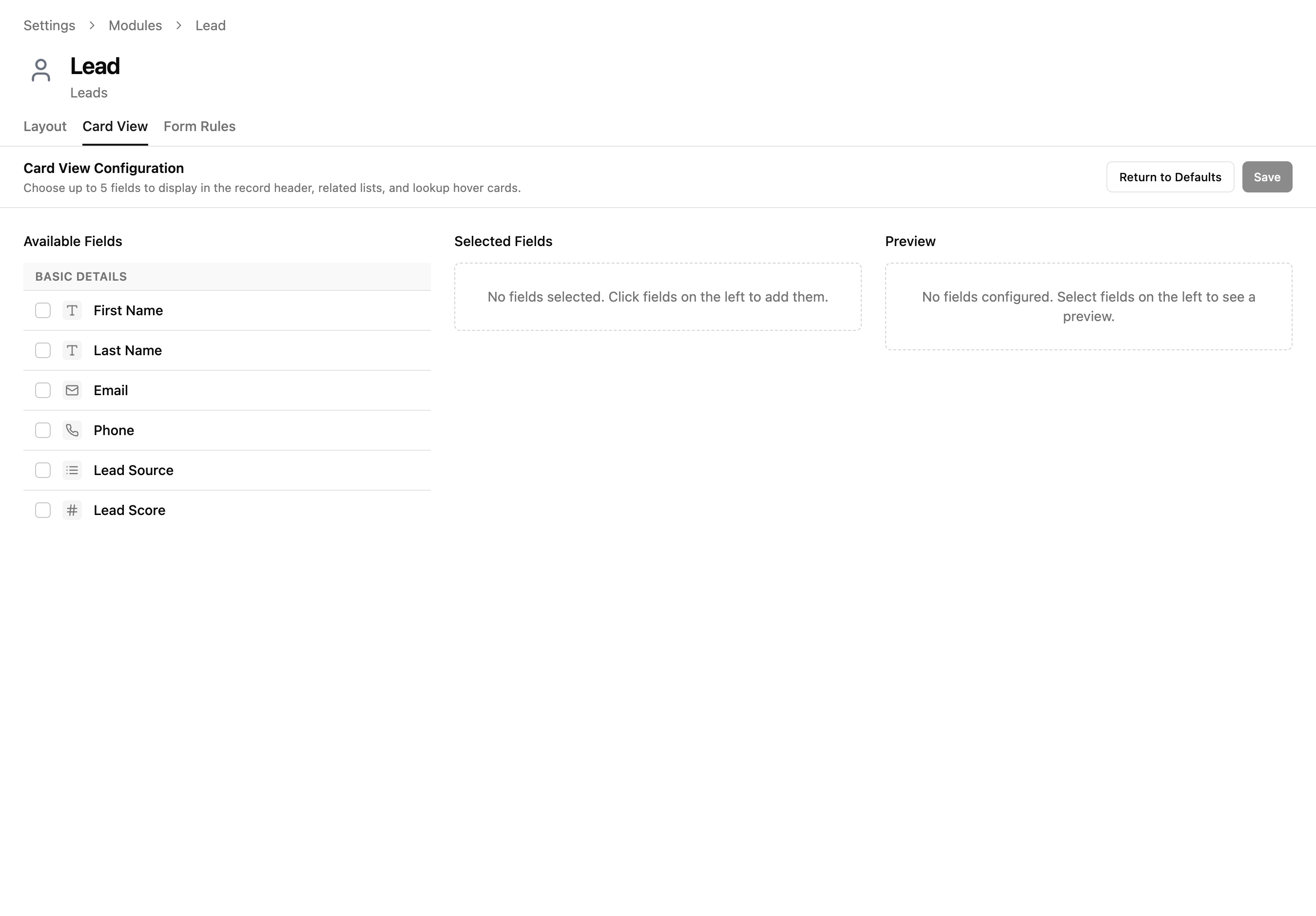
The Card View tab controls which fields appear in the compact record representation — shown in list views, related lists, and when hovering over lookup fields.
Three Panels
| Panel | What It Shows |
|---|---|
| Available Fields | All fields in this module that can be displayed on the card. Click one to add it. |
| Selected Fields | Fields currently chosen for the card view. Drag to reorder. |
| Preview | A live preview of how the card will look with your selected fields. |
Controls
| Button | What It Does |
|---|---|
| Return Card View to defaults | Resets the card view to the system default field selection. |
| Save Card View configuration | Saves your changes. Disabled until you make a change. |
️ Limit: You can select up to 5 fields for the card view. Choose the most identifying fields — the ones that help users recognize a record at a glance.
Form Rules Tab
The Form Rules tab lists all form rules configured for this module. From here you can create new rules, edit existing ones, or toggle them on/off.
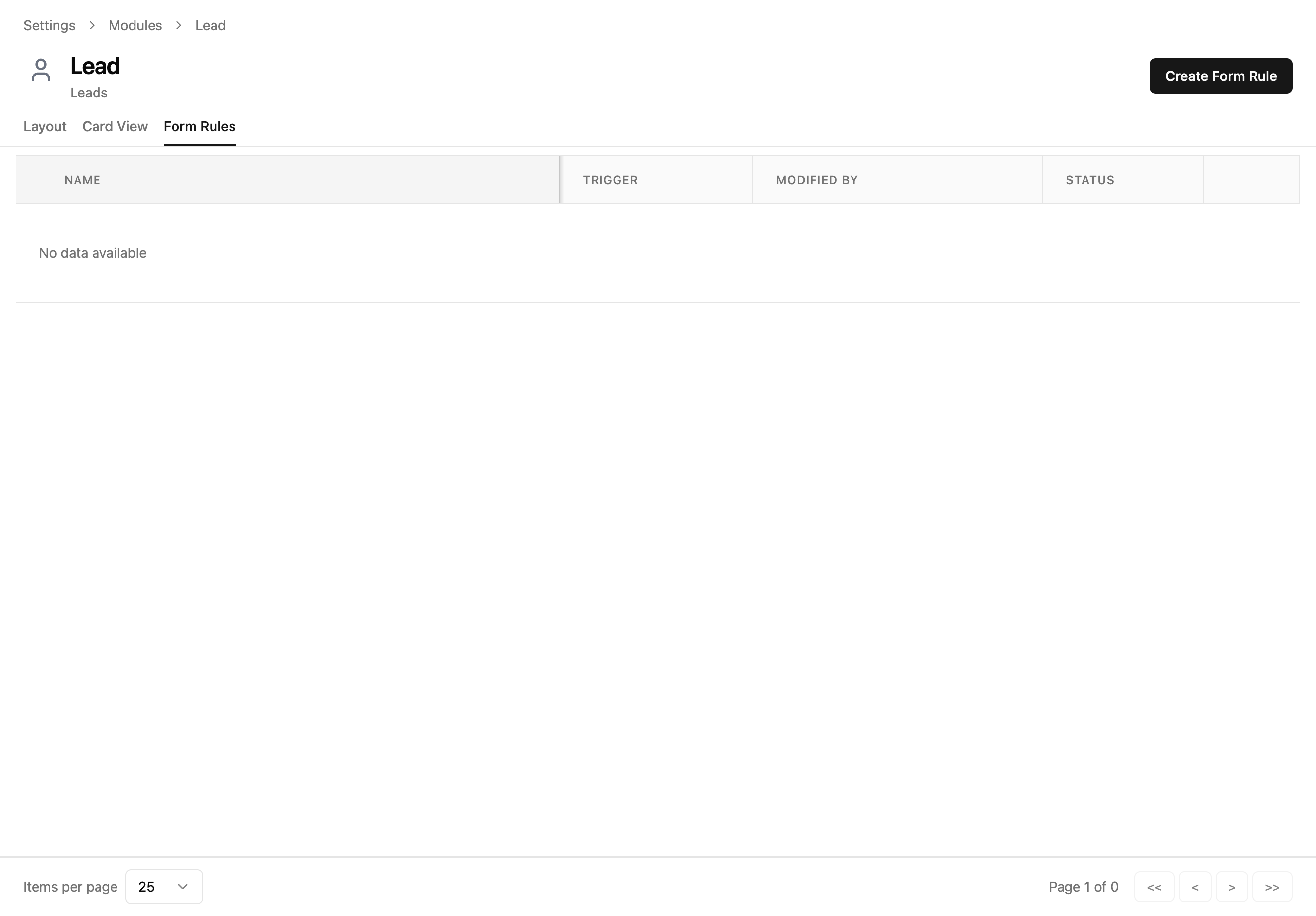
Table Columns
| Column | Description |
|---|---|
| Name | The form rule's display name. Click to edit. |
| Trigger | When the rule evaluates — on Create, Edit, or Both. |
| Modified By | Who last updated this rule. |
| Status | Toggle switch to enable/disable the rule. |
Creating a Form Rule
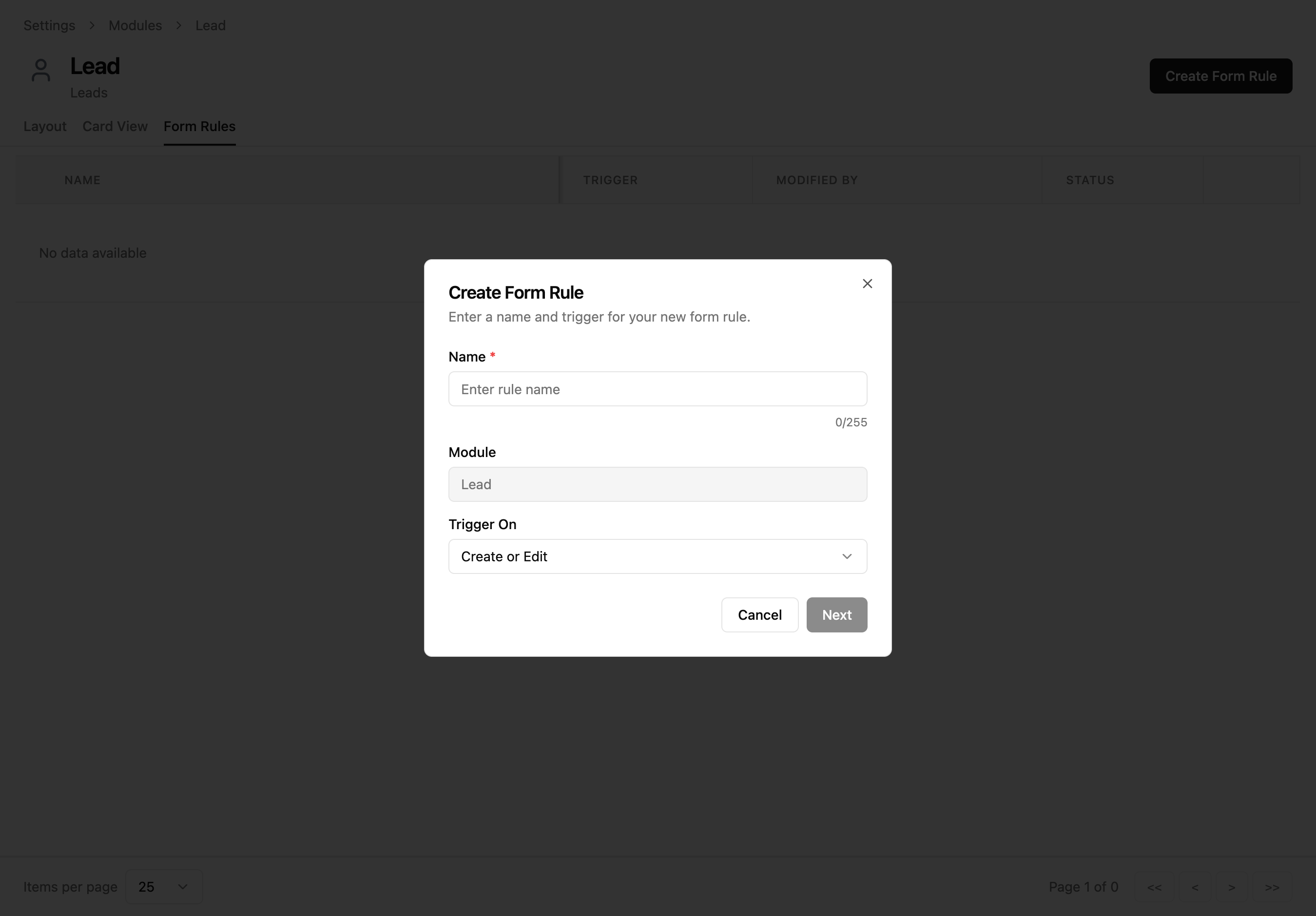
Click "Create Form Rule" to open a dialog where you name the rule and choose when it should trigger.
Dialog Fields
| Field | Required | Description |
|---|---|---|
| Name | <span class="help-badge help-badge-required">Required</span> | A descriptive name for the rule (max 255 characters). Use something that explains what it does. |
| Module | — | Pre-filled and read-only. Shows which module this rule applies to. |
| Trigger On | <span class="help-badge help-badge-required">Required</span> | When the rule evaluates: Create, Edit, or Create or Edit (both). |
Trigger Options
| Option | When It Fires |
|---|---|
| Create | Only when a new record is being created |
| Edit | Only when an existing record is being edited |
| Create or Edit | Every time the form is opened (both scenarios) |
Click "Next" to proceed to the rule builder. The button is disabled until you enter a name.
Form Rule Builder
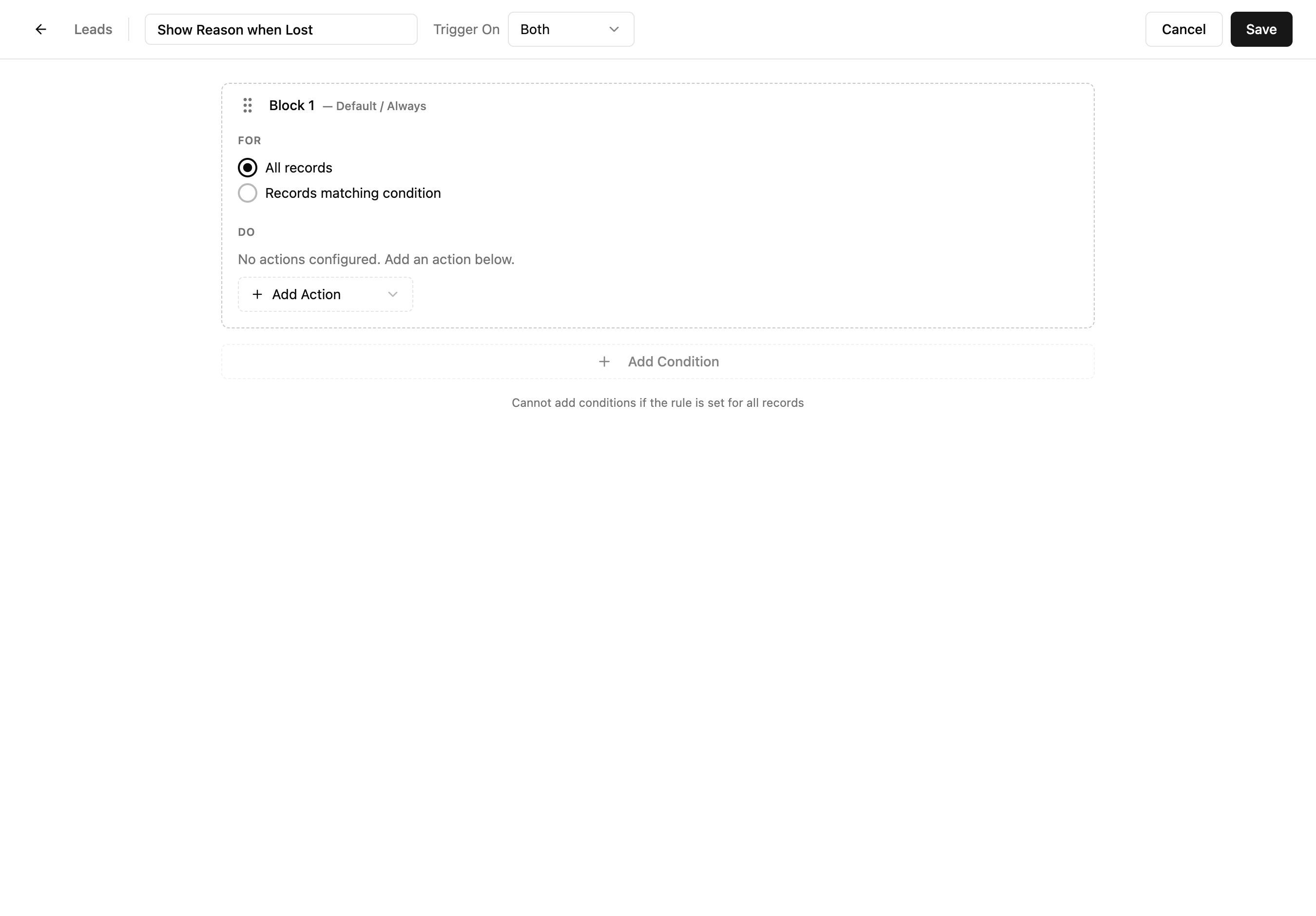
After clicking Next, you land on the full rule builder. This is where you define the logic: which records the rule applies to (FOR) and what happens (DO).
Builder Layout
| Element | What It Does |
|---|---|
| Header bar | Shows module name, editable rule name, Trigger On dropdown, Cancel and Save buttons. |
| Block | A numbered unit of logic. Each block has a FOR condition and one or more DO actions. |
| FOR section | Defines which records this block applies to — all records or records matching a condition. |
| DO section | The actions to perform when the FOR condition is met. |
| Add Action dropdown | Adds a new action to the current block's DO section. |
| Add Condition button | Adds another condition block below the current one. |
FOR Options
| Option | Behavior |
|---|---|
| All records | The block's actions apply to every record, unconditionally. |
| Records matching condition | The block's actions only apply when specific field conditions are met. |
Click "Save" when done. The rule is created in an active state and immediately applies to forms.
Conditions
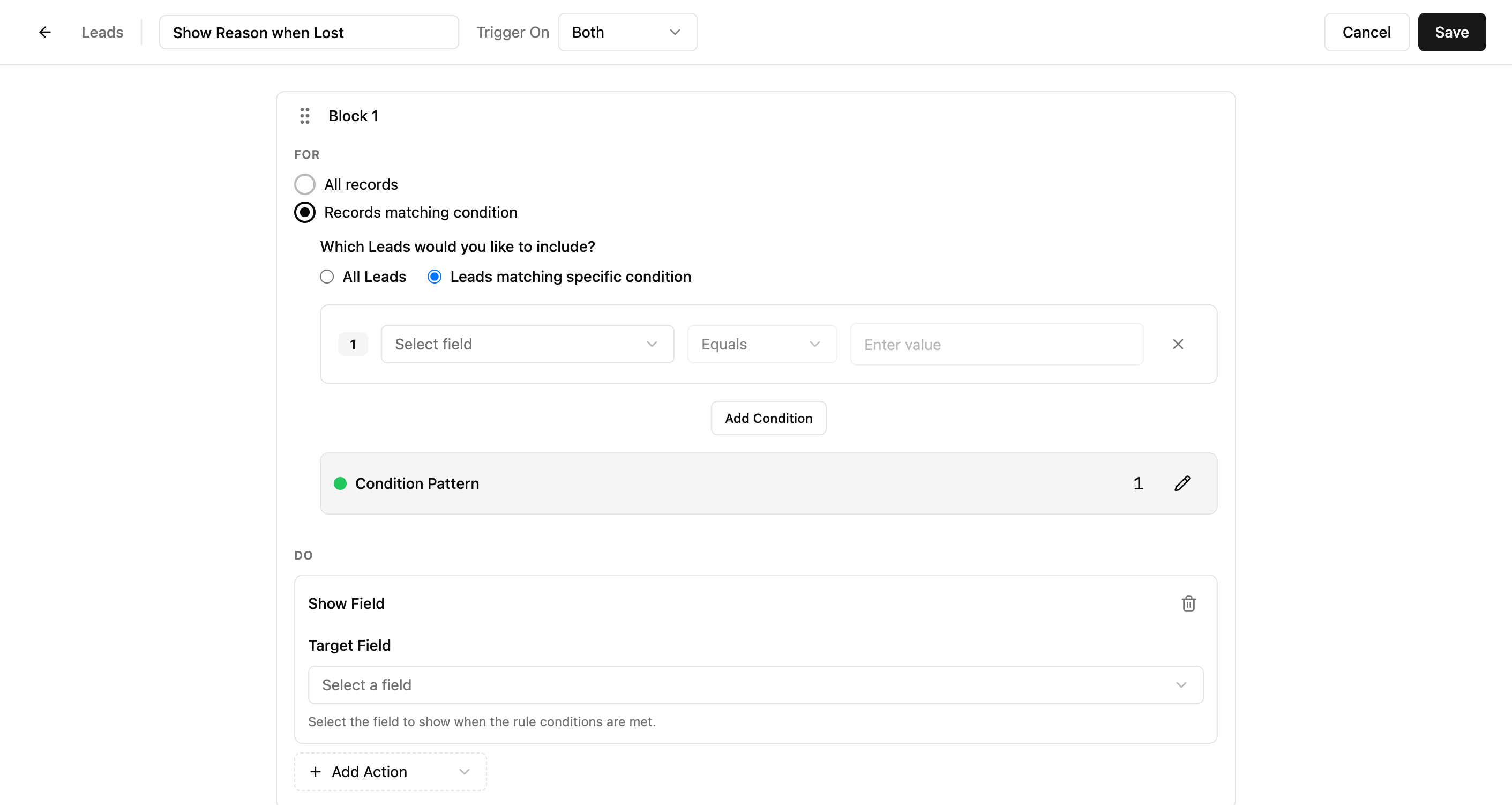
When you select "Records matching condition", a criteria builder appears where you define which records the block applies to.
Condition Row
| Element | What It Does |
|---|---|
| Field selector | Dropdown listing all fields in the module. Pick the field to evaluate. |
| Operator | Comparison type: Equals, Not Equals, Contains, Is Empty, etc. Options change based on field type. |
| Value | The value to compare against. Input type matches the field (text input, dropdown for picklists, date picker for dates). |
| Remove button | Deletes this condition row. |
| Add Condition | Adds another condition row below. |
Condition Pattern
When you have multiple conditions, a Condition Pattern appears showing how they combine. By default, all conditions use AND logic (all must be true). Click the pattern to edit it and use OR logic or custom combinations like (1 AND 2) OR 3.
️ Tip: Start with a single condition. Add more only if you need complex logic. Most form rules work well with one or two conditions.
Actions
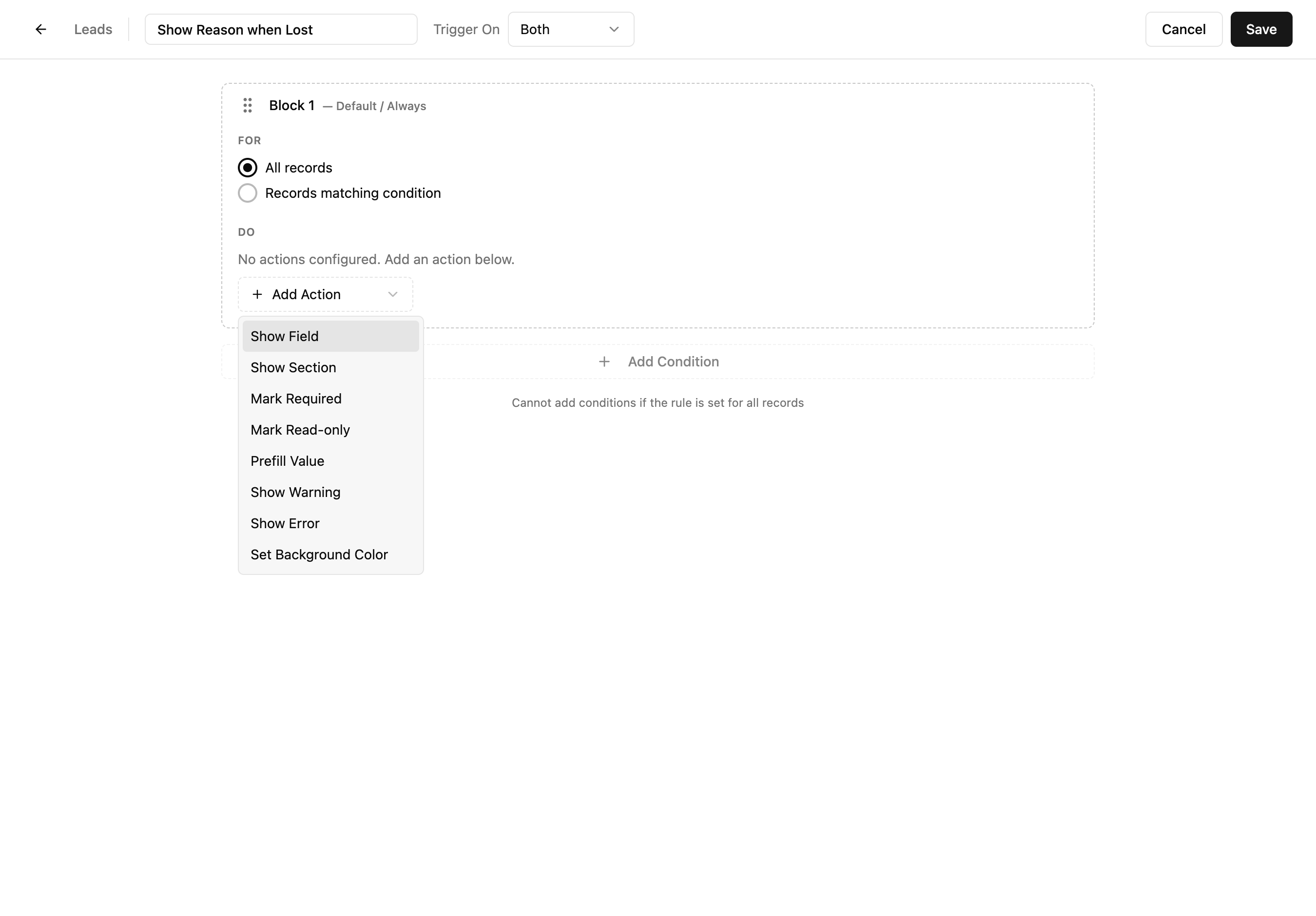
Actions define what happens when the block's condition is met. Add actions from the "Add Action" dropdown in the DO section.
Action Types
| Action | What It Does | Use Case |
|---|---|---|
| Show Field | Makes a hidden field visible on the form. | Show "Loss Reason" only when Status is "Lost". |
| Show Section | Makes an entire hidden section visible. | Show "Shipping Address" section only for physical products. |
| Mark Required | Makes a field mandatory (cannot save without it). | Require "Approval Notes" when Status changes to "Approved". |
| Mark Read-only | Makes a field visible but not editable. | Lock "Amount" after a deal is marked "Closed Won". |
| Prefill Value | Automatically sets a field's value. | Set "Priority" to "High" when "Deal Size" exceeds $100K. |
| Show Warning | Displays a yellow warning message on the form. | Warn when "Discount" exceeds 30%. |
| Show Error | Displays a red error message and blocks saving. | Block save when "End Date" is before "Start Date". |
| Set Background Color | Changes the field's background color for visual emphasis. | Highlight overdue fields in red. |
After Adding an Action
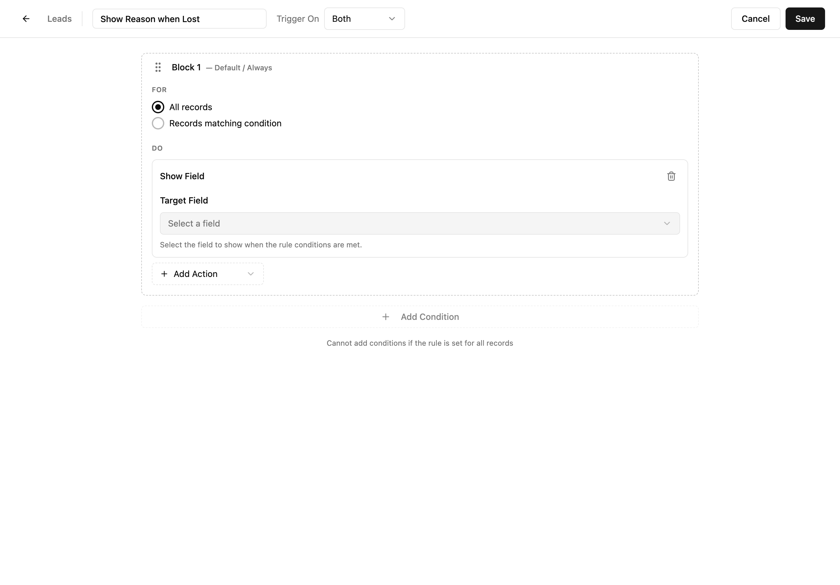
Once you add an action, a Target Field dropdown appears. Select the field this action should affect. You can add multiple actions to the same block — they all execute when the condition is met.
Multiple Blocks
Click "Add Condition" at the bottom to add another block. Each block is independent — it has its own FOR condition and DO actions. Blocks are evaluated in order and can be reordered by dragging.
Real-World Use Case
Equipment rental company building a custom Reservations module
A construction equipment rental company needs to track reservations — which customer booked which machine, for what dates, at what rate. No generic CRM module fits, so they build one from scratch using the Module Builder.
- 1Create a Reservations module with sections: "Booking Details", "Equipment", "Pricing", and "Status"
- 2Add a Lookup field linking to the Customers module and another linking to the Equipment module
- 3Add Date fields for Pickup Date and Return Date
- 4Add a Currency field for Daily Rate and a Formula field that calculates Total Cost (Daily Rate × number of days)
- 5Add a Dropdown field for Status with options: Reserved, Picked Up, Returned, Cancelled
- 6Add an Item Table for accessories included with the rental (safety gear, attachments, etc.)
- 7Use the Permissions tab to make the "Daily Rate" field read-only for the Operations team (only managers can set pricing)
Adapt this for your team: The Module Builder works for any data structure. A law firm might build a Cases module with fields for Case Number, Court, Filing Date, and Opposing Counsel. A healthcare clinic might build a Patient Visits module with Diagnosis, Treatment Plan, and Follow-up Date. Design the fields that match your workflow — Xtend.One adapts to you, not the other way around.
Common Workflows
Add a new field to a module
- 1Go to Settings → Modules and click the module name
- 2In the Layout tab, find the field type in the left panel (e.g., "Dropdown")
- 3Drag it into the desired section in the center panel
- 4In the right panel, enter a Field Label
- 5Configure properties: toggle Required, set Help Text, add options (for dropdowns)
- 6The field is saved automatically when you drop it
Reorganize your form layout
- 1Open the module in the Layout tab
- 2Drag fields up or down within a section to reorder them
- 3Drag fields between sections to move them to a different group
- 4Use the section header's arrow buttons to reorder entire sections
- 5Drag a Section from Field Types to create a new grouping
Configure the card view
- 1Open the module and click the Card View tab
- 2Click fields in the Available Fields list to add them (up to 5)
- 3Drag selected fields to reorder how they appear on the card
- 4Check the Preview panel to see how it looks
- 5Click "Save Card View configuration"
Create a conditional form rule (show a field based on another field's value)
- 1Open the module and click the Form Rules tab
- 2Click "Create Form Rule"
- 3Enter a descriptive name (e.g., "Show Reason when Lost")
- 4Set Trigger On to "Create or Edit"
- 5Click "Next"
- 6In the builder, select "Records matching condition"
- 7Click "Add Condition"
- 8Set the condition: Field = "Status", Operator = "Equals", Value = "Lost"
- 9In the DO section, select "Show Field" from the Add Action dropdown
- 10Set Target Field to "Loss Reason"
- 11Click "Save"
Make a field required only in certain situations
- 1Create a form rule (follow the steps above through step 8)
- 2In the DO section, select "Mark Required" from the Add Action dropdown
- 3Set Target Field to the field you want to make conditionally required
- 4Click "Save"