Overview
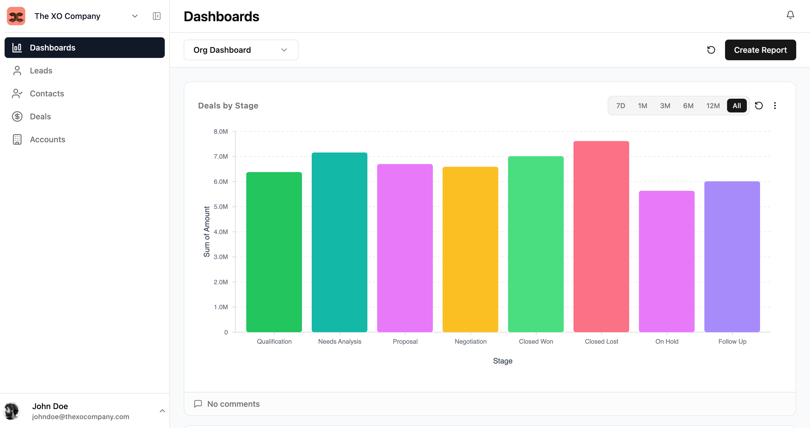
Dashboards give you a visual overview of your business data. Each dashboard contains one or more reports — charts and metrics that summarize records from your modules.
Dashboard
A collection of reports displayed together. You can have multiple dashboards for different purposes (e.g., Sales Overview, Support Metrics).
Report
A single chart or metric widget. Reports pull data from a module, apply aggregations, and display the result as a bar chart, pie chart, line chart, or table.
Viewing Dashboards
Click Dashboards in the sidebar to view your dashboard. Use the dropdown at the top to switch between dashboards. Each report shows time-range filters (7D, 1M, 3M, 6M, 12M, All) to adjust the data window.
Creating a Report
To add a new report to your dashboard:
- 1Navigate to your dashboard and click Create Report.
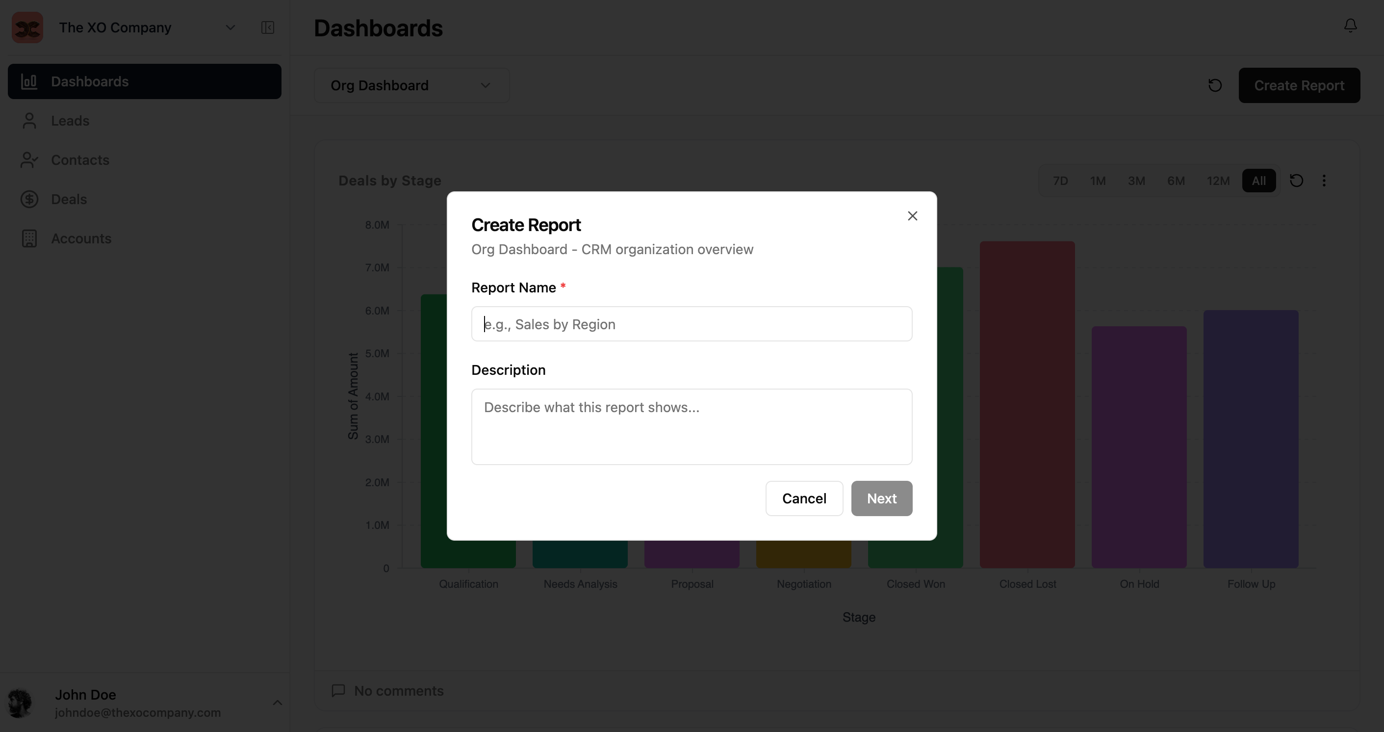
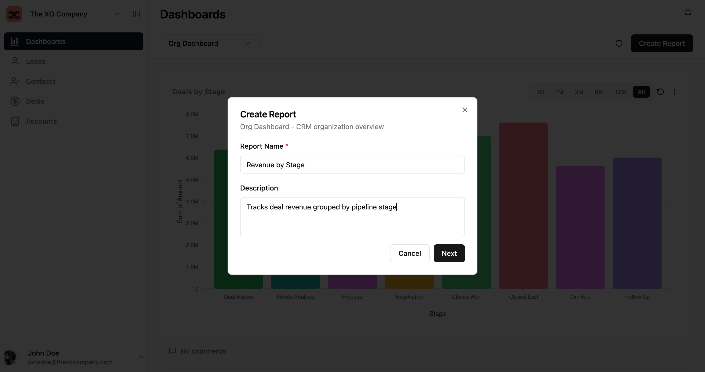
- 2Enter a Report Name and optional description.
- 3Click Next to open the report builder.
Configuring the Report
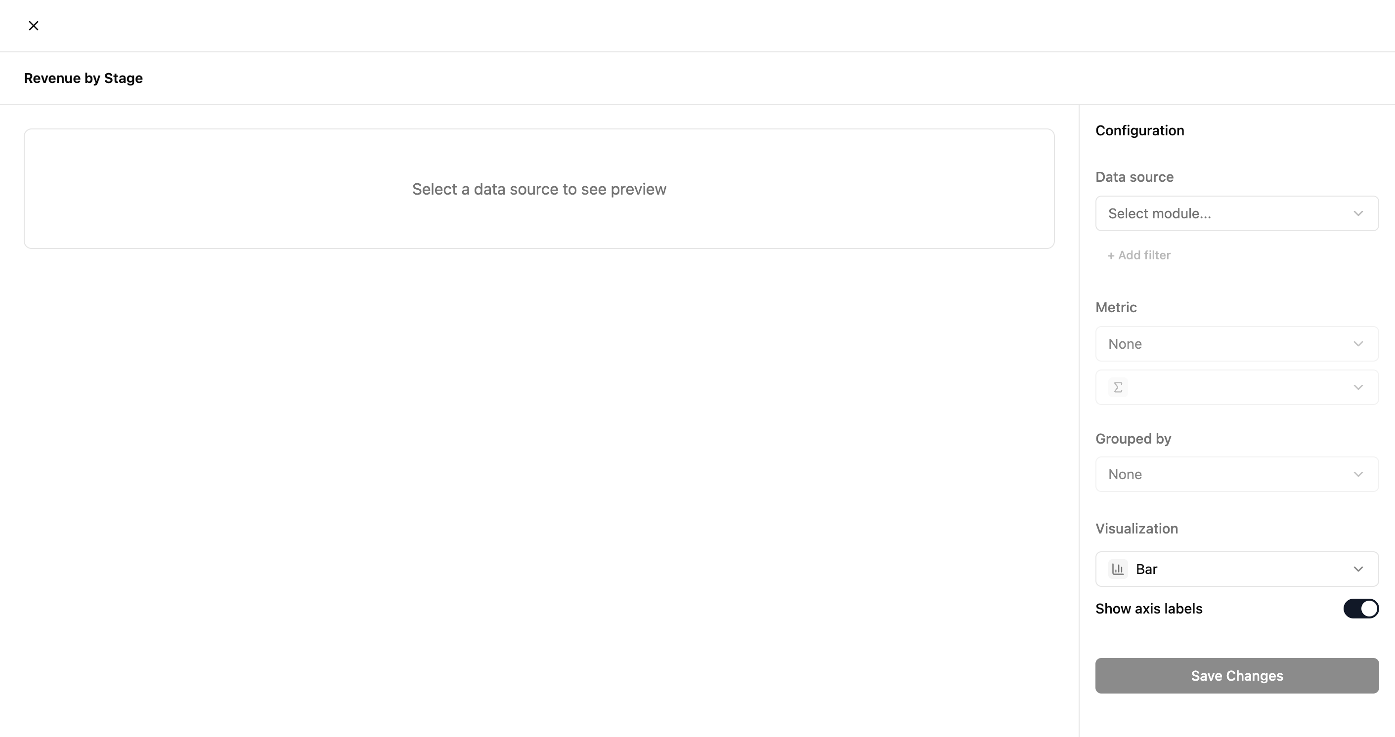
The report builder lets you configure four key settings:
| Setting | Description |
|---|---|
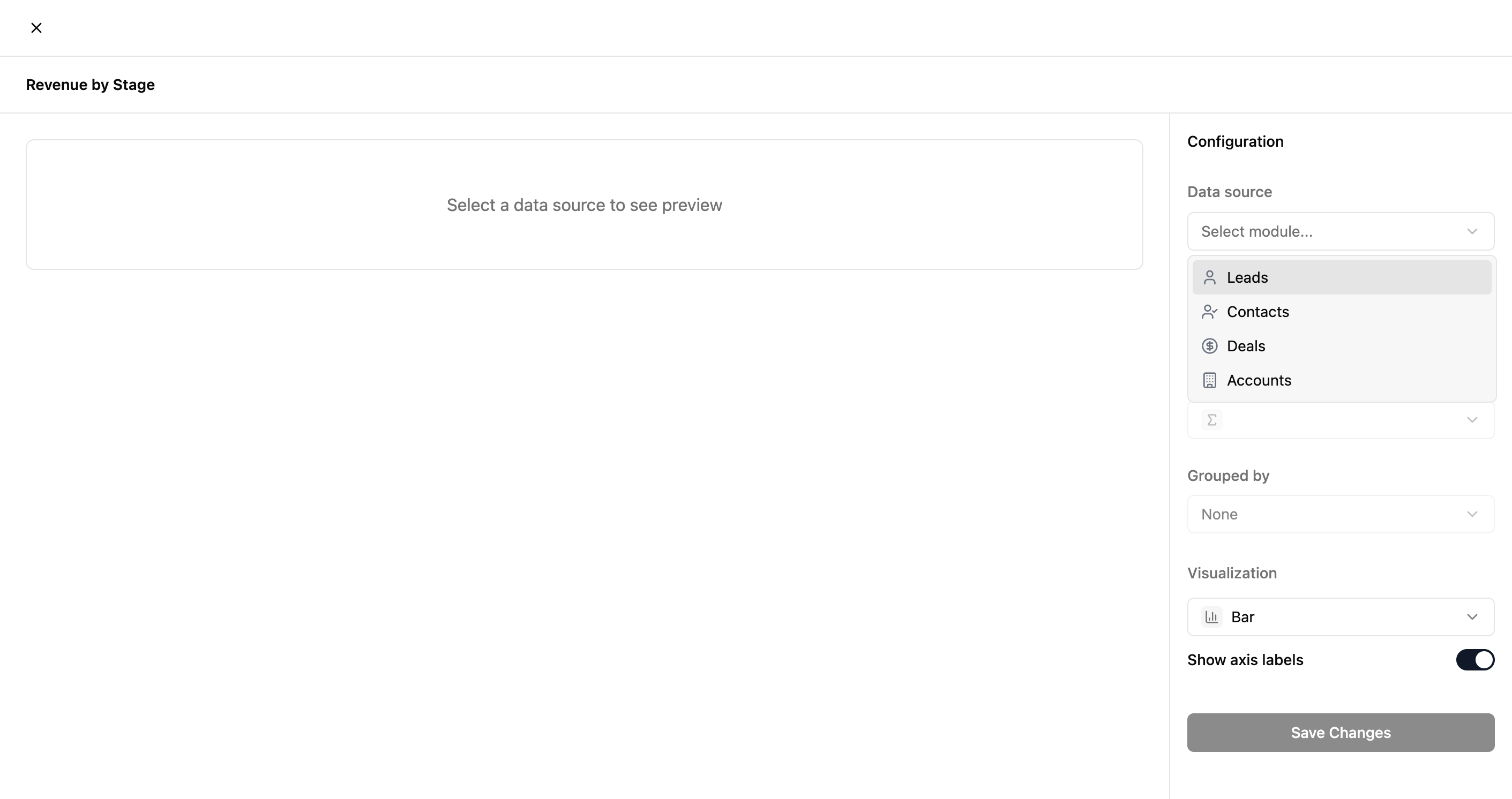
| Data Source | Which module to pull records from (Leads, Contacts, Deals, Accounts). |
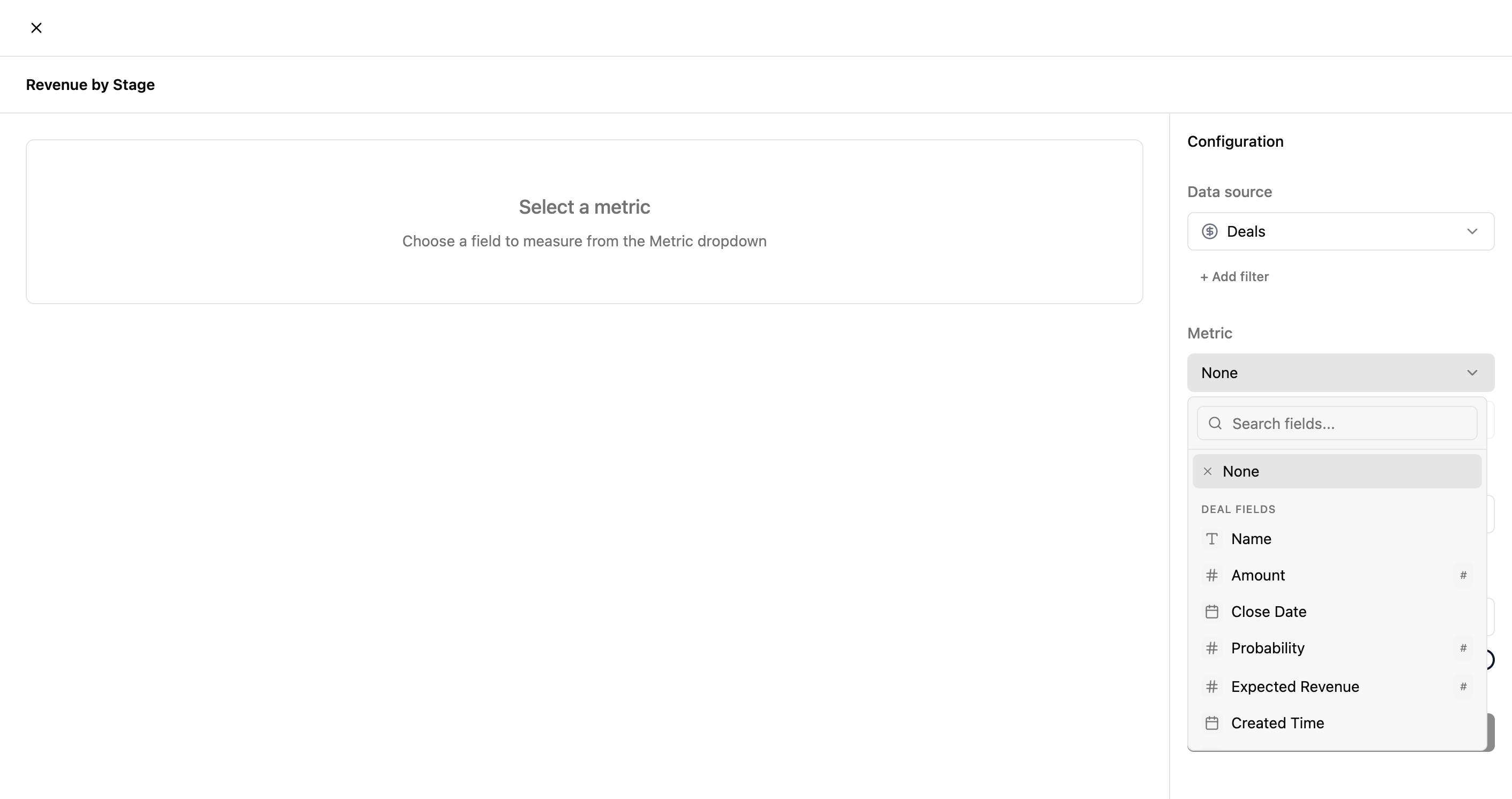
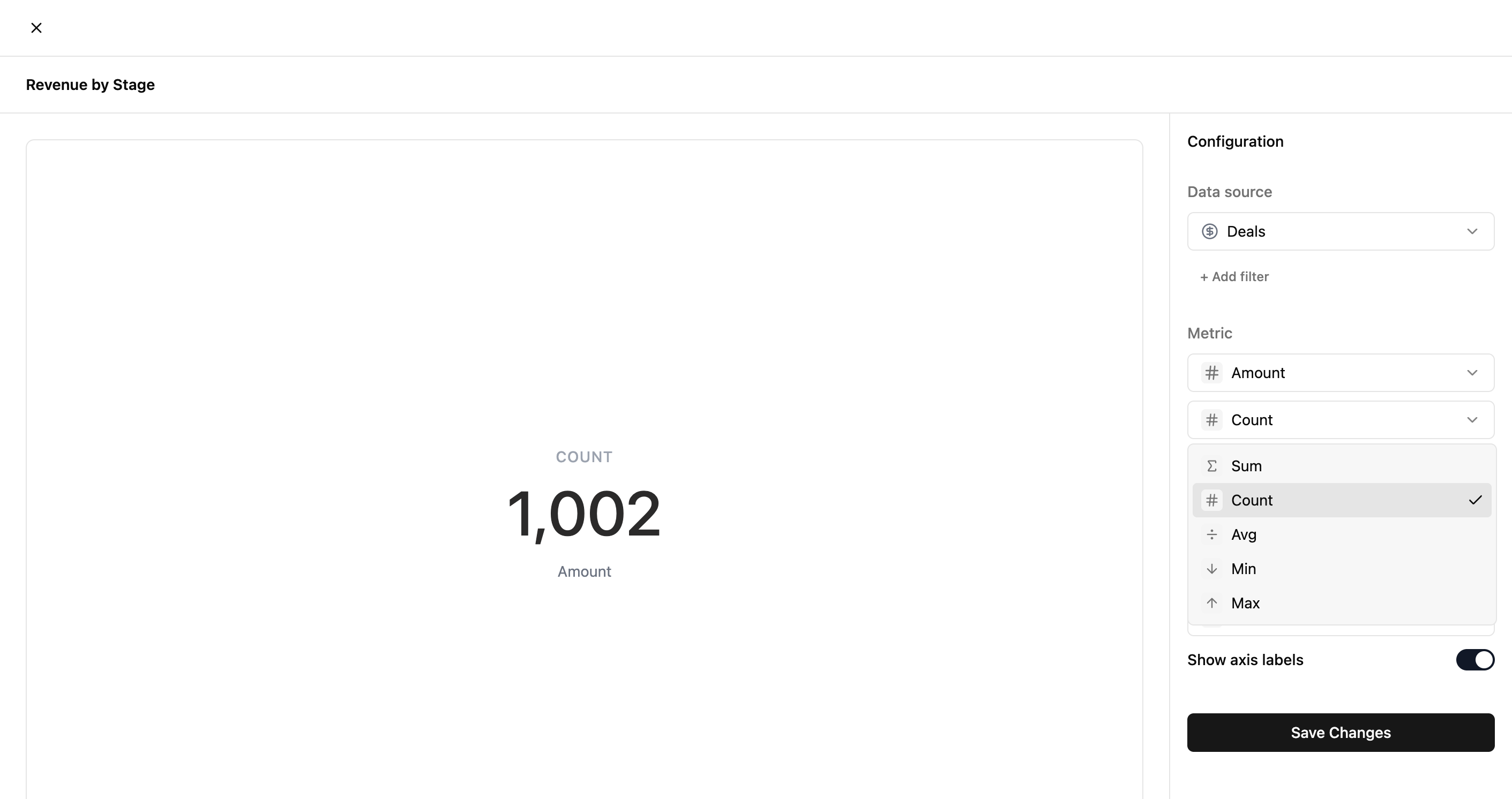
| Metric | The field to measure and how to aggregate it (Sum, Count, Avg, Min, Max). |
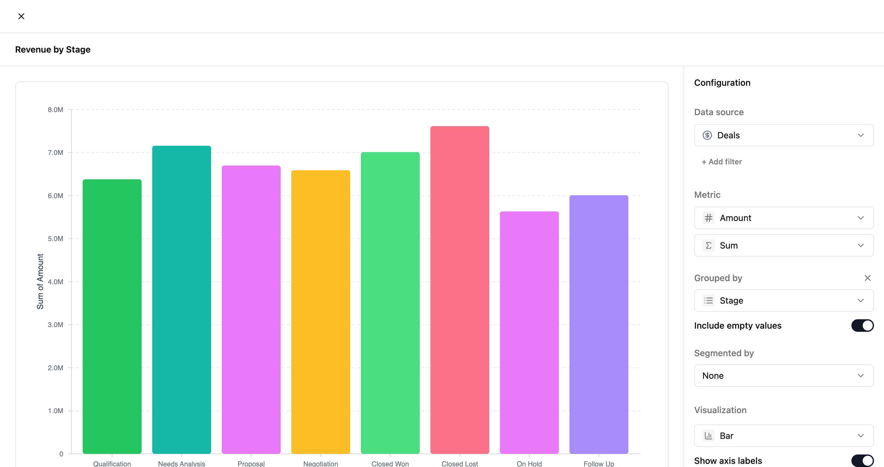
| Grouped By | The field to group results by (e.g., Stage, Owner, Source). |
| Visualization | Chart type — Bar, Pie, Line, Table, or Single Metric. |
Selecting a Data Source
Choose which module's records to report on. The available fields for Metric and Grouped By will update based on your selection.
Choosing a Metric
Select the field to measure. Numeric fields (marked with #) support Sum, Avg, Min, and Max. All fields support Count.
Previewing the Chart
Once you select a Grouped By field, the chart preview updates in real-time. You can switch visualization types to find the best representation for your data.
Saving & Viewing
Click Save Changes to add the report to your dashboard. You'll be taken back to the dashboard where your new report appears alongside existing ones.
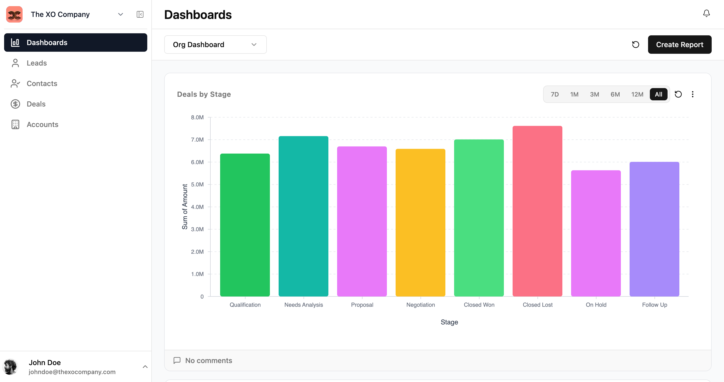
️ Use the time-range filters (7D, 1M, 3M, etc.) on each report to quickly adjust the date window without editing the report configuration.